

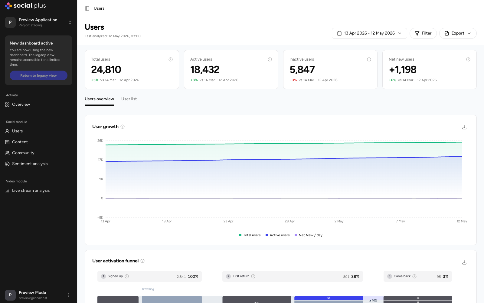
Key metrics
Each card shows the change versus the previous period of equal length.
Filtering
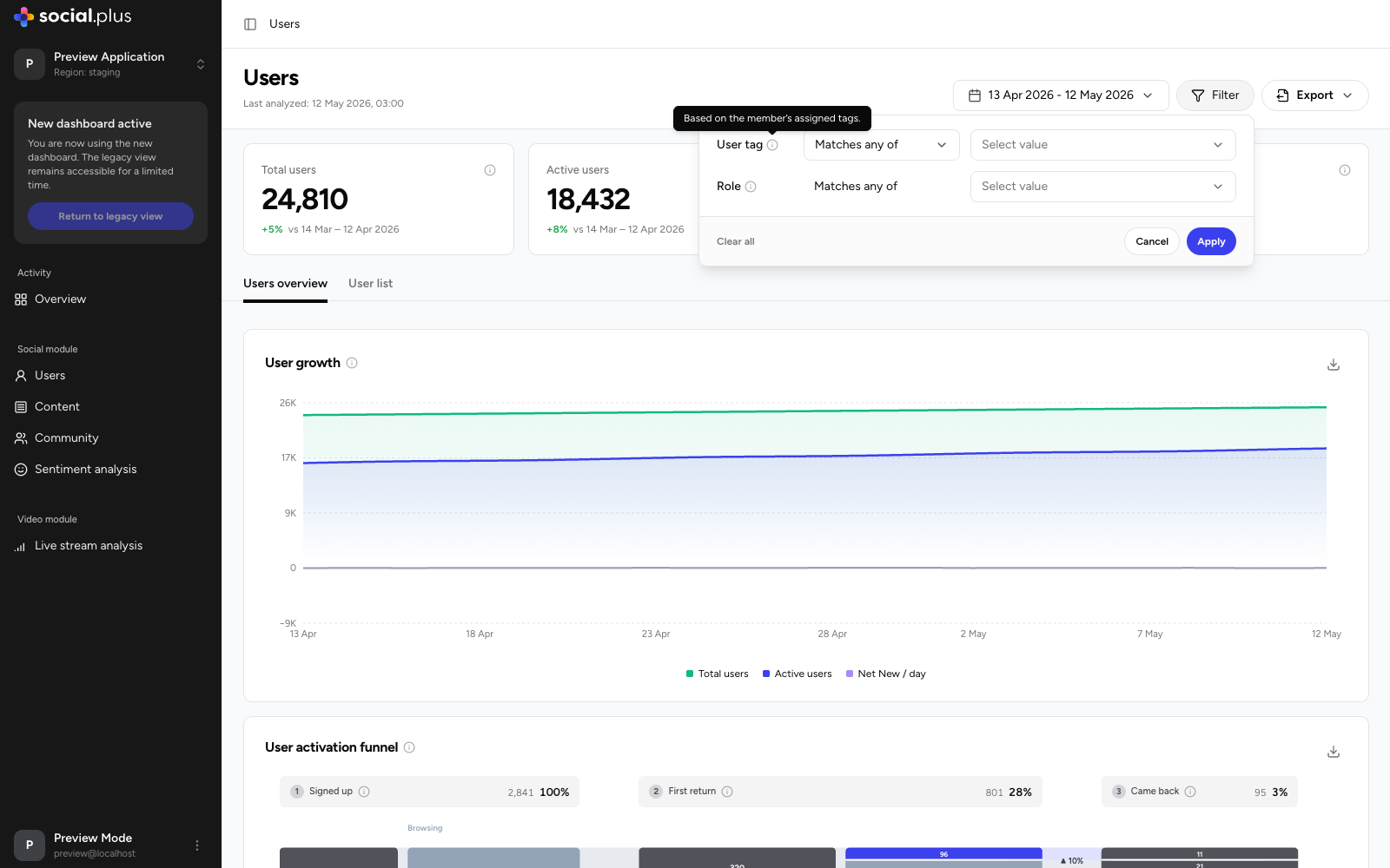
Use Filter in the page header to scope every widget on the page to a segment of your audience:- User tag — match users by their assigned tags.
- Role — match users by role (member, moderator, and so on).
Users overview tab
User growth
Daily trend of Total users, Active users, and Net New / day. Toggle each series independently and export the underlying data as CSV.User activation funnel
A funnel tracking new sign-ups through their first weeks:1
Signed up
Users who created an account in the period.
2
First return
The share who came back after their first session.
3
Came back
The share who returned again and formed a repeat habit.
Engagement depth
Splits your active audience into Contributors (users who created posts, comments, reactions, or votes) and Lurkers (users who only consumed content). The Activity mix panel breaks down the total actions generated by contributors — reactions, comments, posts, and votes — and a toggle lets you compare All users against New users to check whether recent sign-ups engage as deeply as your established base.Cohort retention heatmap
Each row is a weekly sign-up cohort; each column shows the percentage of that cohort still active N weeks after signing up (week 0 is the 100% baseline). Color bands make it easy to scan: greener cells indicate stronger retention. Read down a column to see whether newer cohorts retain better than older ones — the clearest measure of whether product and community changes are working.User list tab
A searchable, sortable directory of individual members for the selected period.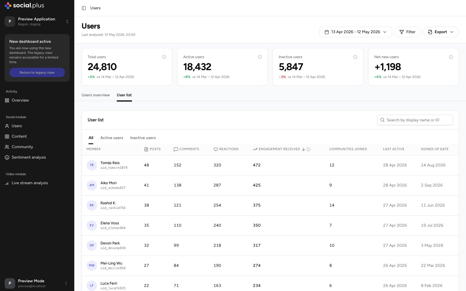
- Search by display name or user ID.
- Segment tabs switch between All, Active users, and Inactive users.
- Sortable columns: Posts, Comments, Reactions, Engagement received, Communities joined, Last active, and Signed up date.