

The new Analytics Dashboard is a redesigned analytics experience with richer widgets, per-widget CSV export, and flexible date and audience filtering. While it rolls out, you can switch back to the legacy dashboard at any time using Return to legacy view in the sidebar.
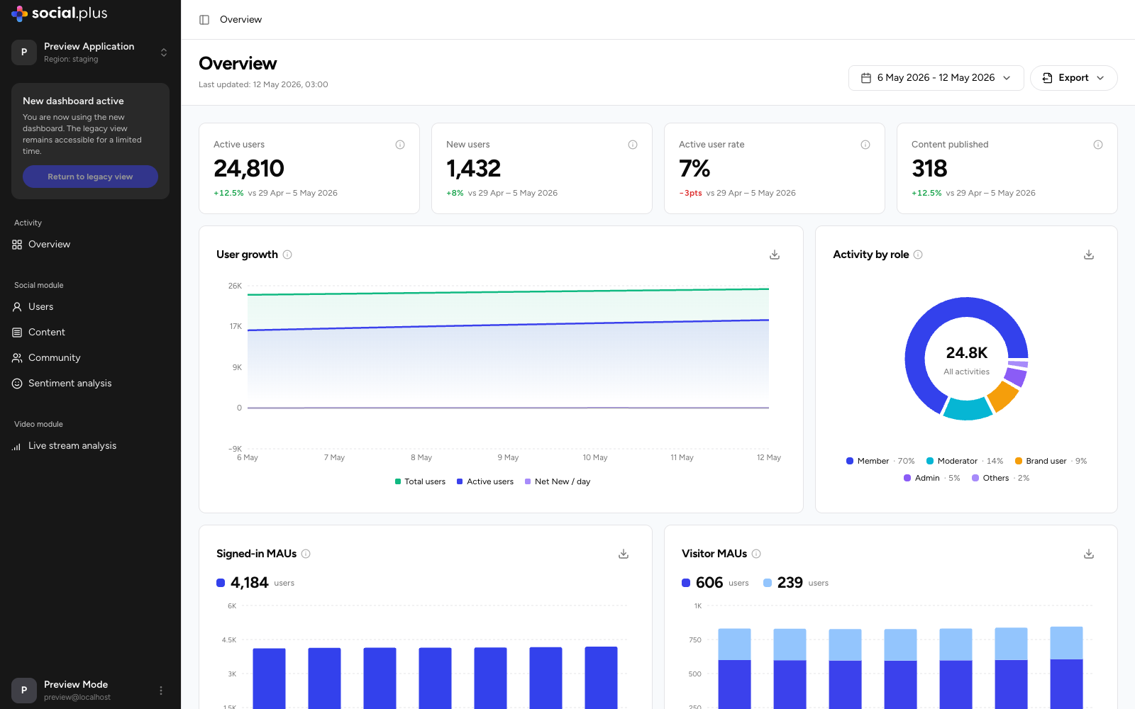
Page controls
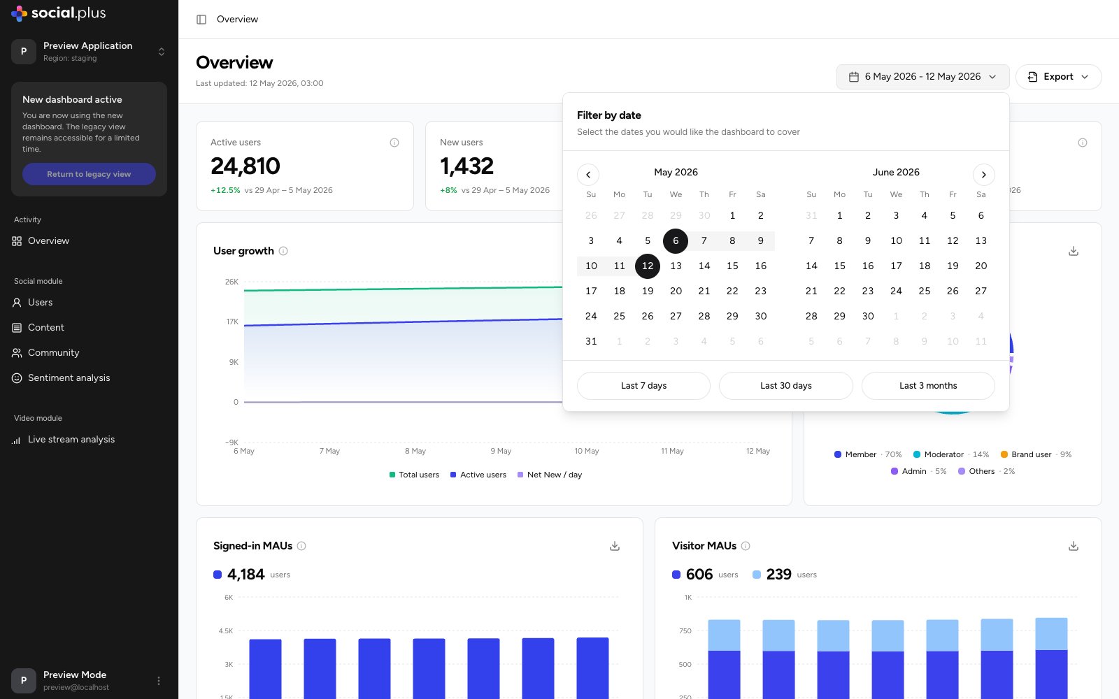
Every page in the new dashboard shares the same header controls:Date range
Pick a preset (Last 7 days, Last 30 days, Last 3 months) or select a custom range from the calendar. All widgets update to the selected period.
Export
Choose which widgets to include, then download their data as CSV. Each widget also has its own Export CSV button.
Tooltips
Every metric has a More information icon explaining exactly how it is calculated.
Key metrics
Four KPI cards summarize the selected period:Widgets
User growth
A daily trend chart with three toggleable series — Total users, Active users, and Net New / day. Use it to correlate growth spikes with campaigns or releases, and to spot days where churn outpaced sign-ups (negative net-new).Activity by role
A donut chart breaking all activities in the period down by the role of the user who performed them — Member, Moderator, Brand user, Admin, and Others. A healthy community is typically member-driven; a high admin or brand share suggests organic engagement still needs seeding.Signed-in MAUs and Visitor MAUs
Two month-to-date charts tracking your billable usage as it accumulates:- Signed-in MAUs — authenticated monthly active users.
- Visitor MAUs — anonymous visitors, with a separate Overused visitors series showing visitors who crossed the monthly fair-use threshold and are counted toward signed-in usage for billing.
Concurrent connections
Peak simultaneous connections over time. Use this for capacity planning and to confirm infrastructure headroom ahead of scheduled events or live streams.Top communities
A ranked table of your most active communities in the period, showing Posts, Comments, Reactions, Users joined, Users left, and Post engagement rate for each. It’s the fastest way to see which communities are carrying engagement — and which are leaking members.Historical monthly usage
A month-by-month table of consumption for billing reconciliation, covering signed-in MAUs, visitor and overused-visitor MAUs, inactive signed-in users, video watch minutes by resolution (SD / HD / FHD), file storage, moderated content volumes (pre- and post-moderated images, text, videos), and video moderation duration. Export it as CSV to feed finance or capacity reports.Next steps
Users
Growth, activation funnel, engagement depth, and cohort retention
Content
Post volume, reach and impressions, and per-post performance
Community
Per-community health, role composition, and drill-down trends
Sentiment Analysis
AI-powered topic detection, sentiment scoring, and summaries
Livestream Analytics
Viewer engagement, watch time, and per-stream reports