

Key Benefit: Enable rich content creation and engagement with comprehensive post components supporting text, media, polls, mentions, link previews, and advanced accessibility features across all platforms.
Feature Overview
The Post Components UIKit provides a complete suite of tools for post creation, editing, and content management. From rich media posts and interactive polls to advanced features like @mentions, link previews, and accessibility support, these components create the foundation for engaging social content experiences.Text & Media Posts
Create rich content with text, images, and videos. Support for optional titles, mentions, hashtags, and multiple attachments.
Interactive Polls
Engage users with text or image-based polls. Users can change/remove votes with customizable duration and multiple selections.
Livestream Posts
Real-time livestreaming with interactive chat and reactions, available in Livestreaming post in a community.
Engagement & Comments
Inline comments, reactions, @mentions, and real-time interaction tracking for active discussions.
Sharing & Discovery
Shareable deep links, link previews, hashtags, and gallery-to-post linking for better content discovery.
Management & Moderation
Post editing, content moderation tools, and comprehensive management for all post types.
Platform Support
Legend: ✅ Full Support | ❌ Not Available
Post Types & Features
Post Types
Post Types
Supported Content Types
- Text Posts: Rich text content with optional post titles and free-form hashtags for better discoverability
- Rich Media Posts: Images and videos with enhanced display, alt text support, and a swipeable carousel for posts with multiple attachments
- Livestream Posts: Livestreaming with interactive chat and reactions
- Poll Posts: Interactive polls with voting and real-time results
- Text-only polls with multiple choice options
- Image polls with visual voting options (supported on iOS, Android, React)
- Vote management - users can change or remove their poll votes
Engagement Features
Engagement Features
User Interaction Capabilities
- Reactions: Multiple sentiment expressions
- Inline Comments: Threaded conversations displayed directly under posts on feeds for improved engagement
- Mentions: @username functionality with notifications and user discovery
- Sharing: Content distribution with shareable deep links for posts
- Poll Voting: Interactive voting with the ability to change or remove votes before poll closes
Advanced Features
Advanced Features
Enhanced Functionality
- Post Titles: Optional titles for better post organization and context
- Free-form Hashtags: Add hashtags anywhere in post content for improved content discovery and categorization
- Shareable Deep Links: Generate and share direct links to specific posts for seamless navigation
- Link Preview: Automatic metadata extraction and display for URLs shared in posts
- Link Highlighting: Detect links using
AmityLink.indexandAmityLink.length, highlight matching text, and openlink.urlon tap - Gallery-to-Post Linking: Community gallery media is linked to original posts, providing full context when viewing images
- Brand User: Professional/admin posting capabilities with enhanced visibility
- Accessibility: Comprehensive alt text support for images ensuring inclusive content
- Moderation: Content reporting and management for community safety
Product Tagging
Product Tagging
Commerce Integration & Product Discovery
- Text Product Mentions: Tag products in post captions using
@trigger with product suggestion overlay for easy discovery - Media Product Tags: Tag products directly on images and videos with coordinate-based positioning to highlight specific items
- Product Search: Real-time product search for quick product discovery
- Multi-select Support: Select multiple products per post (maximum 20 products combined across text and media)
- Product Carousel Display: View all tagged products in a scrollable carousel below post content
- Product Links: Tap products to open in in-app browser without interrupting social experience
- Edit Product Tags: Add, remove, or modify product tags on existing posts while maintaining engagement metrics
- Per-Media Limits: Support per-media tagging with individual product limits (max 5 products per media item)
- Product Tag Indicator: Visual indicator on media thumbnails showing count of tagged products
- Context-Aware Headers: Different labels for product display based on content type (post vs image/video)
Implementation Guide
- Post Detail Page
- Post Content Component
- Post Composer
- Media Attachments
- Poll Components
Media Carousel
Posts with two or more images or videos are displayed as a horizontally swipeable carousel — one full-width frame per attachment, shown in the order they were added. A post with a single attachment is shown as one full-width frame.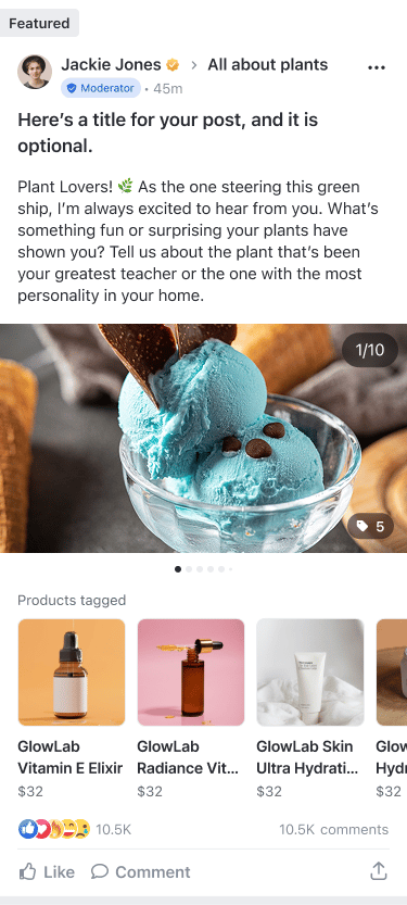
Every attachment is reachable by swiping, so nothing is hidden or truncated. The media carousel is available on iOS, Android, React, and React Native.
How It Works
Navigation
Each image or video gets its own full-width frame, with no wrap-around at the first or last frame. On mobile, members swipe one frame at a time. On desktop, swipe is disabled and members use the arrow buttons on the frame — the left arrow is hidden on the first frame and the right arrow on the last.
Consistent Height
The frame shape is classified from the first attachment and locked for the whole carousel, so the post height never jumps between frames.
Position Indicator
A pagination indicator and an
n/total counter show the current frame and update as members move through the carousel. Desktop shows an indicator strip alongside the arrow buttons.Full-Screen Viewer
Tapping a frame opens the full-screen viewer at that frame in its original aspect ratio; closing returns to the same frame. In the viewer, videos autoplay and keep their mute state across swipes.
Frame Ratio
The carousel picks one frame shape from the first attachment — landscape (16:9), square (1:1), or portrait (4:5) — and locks it for every frame, so the post height never shifts as members move through the carousel. Each frame is cropped to fill the locked shape, while the full-screen viewer shows each item at its original aspect ratio. Portrait videos keep their orientation. In the composer, if the first attachment is removed, the shape re-derives from the new first attachment.Composer Preview
When creating or editing a post, the composer previews attachments in the same carousel format before publishing. Each frame carries its own controls:- Remove — delete that attachment from the post
- Alt text — add descriptive text (images only)
- Product tag — open the product picker for that frame
Limits & Constraints
Product Tagging
Product tagging enables commerce integration within posts, allowing users to tag products in text and media, and viewers to discover and open tagged products directly from a post.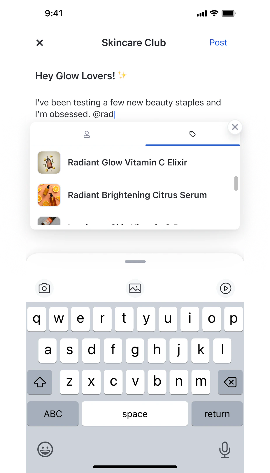
Product tagging requires the Product Catalog to be configured and enabled for your network in the console. The feature is available on iOS, Android, and Web only.
How It Works
Text Mentions
Type
@ in the post caption to trigger a suggestion overlay with a Products tab. Selecting a product inserts it as a single token — backspace removes the entire mention.Media Tags
Each image or video in a post has its own tag entry point. Tap the tag button on a media item to open the product picker for that item.
Product Carousel
All tagged products are displayed in a scrollable list below the post content — in both the feed and post detail view.
In-App Browser
Tapping a product opens its link in an in-app browser on iOS and Android, and in a new tab on Web. Override this to route the tap yourself — see below.
Customize the Product Tap
Opening the product link is the default. OverrideonPostProductTagClick on AmityGlobalBehavior to send the tap to your own product screen or commerce flow instead.
The handler receives the tapped product on the context. Read it to decide where to go.
AmityProduct carries productId, productName, productUrl, price, currency, and thumbnailUrl. Use productId to look the item up in your own catalogue, or productUrl to open it yourself.
The platforms differ in how you fall back to the default.
- Android — the handler returns a
Boolean. Returntruewhen your app handled the tap, orfalseto get the built-in product web view. - iOS — the handler returns no value, so an override always replaces the default. Call
super.onPostProductTagClick(context:)where you want the in-app browser instead. - Web — the handler returns no value and behaves like iOS. There is no
superto call: openproduct.productUrlyourself if you want the default behavior for some products.
Limits & Constraints
Components Used in Posts
Product tagging in posts uses two shared UIKit components. See Product Tagging Components for full parameter reference and code examples.
The
ProductTagSelectionComponent is opened from the Post Composer Page — either from the @ mention flow in the text editor, or from the tag button on a media attachment. The ProductTagListComponent is rendered automatically within Post Detail and feed views when a post has tagged products.
Pinned & Featured Posts
When a post is pinned or featured, the UIKit renders a read-only badge on it in the feed. This applies to any post, not just events. Pinning and featuring are managed in the Console — there is no in-app control in the UIKit to change that state; the component only reflects it. See the pin/feature note for how the state is set.A post published to a user’s own feed can never be pinned. Global featuring requires a public community.
Related Features
Social Feeds
Content Display Feed components for displaying and organizing posts
Comments & Reactions
Engagement Features User interaction and engagement components
Communities
Community Features Community management and participation tools
Product Tagging Components
Commerce Integration Shared UIKit components for product selection and display