Key Benefit: Foster dynamic community engagement with comprehensive comment systems, emoji reactions, and real-time interaction features that encourage meaningful conversations and content discovery.
Feature Overview
The Comments & Reactions UIKit provides comprehensive tools for building engaging comment systems and reaction features. From threaded conversations and reply management to emoji reactions and user interaction tracking, these components create the foundation for vibrant community discussions and content engagement.Comment Systems
Rich Conversations
- Threaded comment displays
- Comment creation and editing
- Reply management
- Mention support in comments
Reaction Features
Expressive Engagement
- Emoji reaction systems
- Reaction list displays
- Real-time reaction updates
- Custom reaction support
Interactive Components
Community Engagement
- Comment tray interfaces
- Reaction picker components
- User interaction tracking
- Brand user comment support
Content Management
Moderation Tools
- Comment reporting
- Content moderation
- User blocking capabilities
- Administrative controls
Platform Support
| Feature | iOS | Android | React | React Native | Flutter |
|---|---|---|---|---|---|
| Create / Edit Comment | ✅ | ✅ | ✅ | ✅ | ✅ |
| View Comments | ✅ | ✅ | ✅ | ✅ | ✅ |
| Report Comment | ✅ | ✅ | ✅ | ✅ | ✅ |
| Mention in Comments | ✅ | ✅ | ✅ | ✅ | ✅ |
| Comment Tray | ✅ | ✅ | ✅ | ❌ | ✅ |
| Brand User Comment | ✅ | ✅ | ✅ | ❌ | ✅ |
| Comment Ads | ✅ | ✅ | ✅ | ✅ | ❌ |
| Multi-Level Comment Replies (2-Level) | ✅ | ✅ | ✅ | ❌ | ❌ |
| Post / Comment / Story Reactions | ✅ | ✅ | ✅ | ✅ | ✅ |
| View Reactions | ✅ | ✅ | ✅ | ✅ | ✅ |
| Multiple Reactions | ✅ | ✅ | ✅ | ❌ | ❌ |
Component Features
Comment Features
Comment Features
Interactive Comment Systems
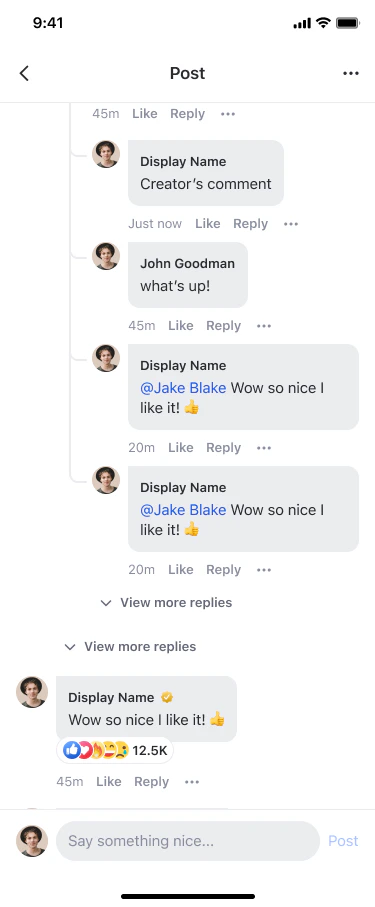
- Threaded Comments: Nested reply conversations with two-level display model
- Comment Creation: Rich text editing with mention support
- Comment Management: Edit, delete, and report capabilities
- Real-time Updates: Live comment synchronization
Reaction Features
Reaction Features
Expressive User Engagement
- Emoji Reactions: Pre-defined and custom emoji support
- Reaction Analytics: User lists and engagement metrics
- Multiple Reactions: Support for various reaction types
- Real-time Updates: Instant reaction synchronization
Reply Threading Features
Reply Threading Features
Advanced Features
Advanced Features
Enhanced Functionality
- Mention System: @username functionality with notifications
- Content Moderation: Reporting and administrative controls
- Brand User Support: Professional commenting capabilities
- Accessibility: Screen reader and keyboard navigation support
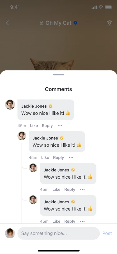
Multi-Level Comment Replies
The UIKit comment system supports a two-level display model for replies, enabling richer conversations while keeping the UI clean.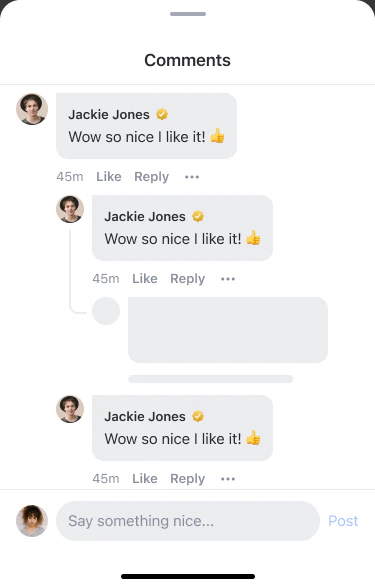
Comment Hierarchy
| Level | Display | Reply Action |
|---|---|---|
| Level 0 (L0) | Top-level comment on a post/story | ”Reply” creates an L1 reply |
| Level 1 (L1) | Direct reply to L0, indented under the parent | ”Reply” creates an L2 reply |
| Level 2 (L2) | Reply to an L1 comment, indented under L1 | ”Reply” creates another L2 reply (auto-resolved to L1 ancestor) |
When a user taps “Reply” on an L2 reply, the compose bar shows “Replying to @[author-name]” and pre-fills the text with
@[author-name]. The reply is created under the L1 ancestor, not the L2 comment itself.Reply Thread Behavior
Expand & Load More
Expand & Load More
Paginated reply threads with progressive loading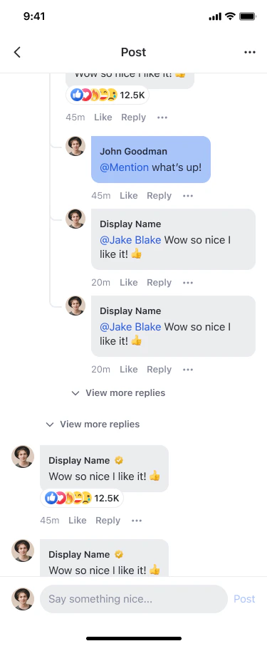
- When an L0 comment has replies, a “View replies (n)” button appears below it
- Tapping it loads the first page of replies (5 per batch)
- If more replies exist, a “View more replies” button appears at the end of the thread
- L1 replies are sorted newest first (
lastCreated) - L2 replies are sorted oldest first (
firstCreated) for chronological reading
Reply Compose Bar
Reply Compose Bar

Deletion Behavior
Deletion Behavior
Level-specific deletion rules
- L0 soft delete: Comment shows a placeholder (“This comment has been deleted”) — child replies remain visible
- L1 delete: Reply bubble is removed from the UI; L0 parent’s reply count decrements
- L2 delete: Only the L2 bubble is removed; L1 parent and sibling L2 replies remain
Inline Edit
Inline Edit
Edit replies directly within the bubble
- The bubble transforms into an editable text field with Cancel and Save buttons
- Save is disabled if text is empty or unchanged
Notification Navigation
Notification Navigation
Limitations
Implementation Guide
- Comment Tray Component
- Reaction List Component
- Multiple Reactions
Comprehensive comment interface with threading and reactionsThe Comment Tray Component facilitates dynamic interaction through comments and reactions, designed to foster community engagement directly within content viewing experiences.
Features
| Feature | Description |
|---|---|
| View, create or edit comments | Users can view, create or edit text comments or reply comments, and add reactions to comments |
| Multi-level replies | Reply to any comment or reply (L0, L1, L2) with “Replying to” chip and @mention pre-fill |
| Expand reply threads | ”View replies (n)” button to expand reply threads with paginated loading (5 per batch) |
| Inline edit | Edit L1/L2 replies directly within the comment bubble with Cancel/Save actions |
| Per-level deletion | Soft-deleted L0 shows placeholder; deleted L1/L2 replies are silently removed |
| Threaded conversations | Support for nested replies with a two-level display model |
| Real-time updates | Live synchronization of comments and reactions |
Customization Options
| Config ID | Type | Description |
|---|---|---|
*/edit_comment_component/* | Component | You can customize theme |
*/edit_comment_component/cancel_button | Element | You can customize button_text, icon and background_color |
*/edit_comment_component/save_button | Element | You can customize button_text, icon and background_color |
*/comment_tray_component/* | Component | You can customize close_icon |
Code Examples
Navigation Behavior
Custom navigation behavior can be implemented to enhance or modify the interaction flow on the AmityCommentTrayComponent.Component Management Strategies
Comment System Design
Comment System Design
Creating engaging conversation experiencesDesign comment systems that encourage meaningful dialogue while maintaining community standards. Implement clear threading, easy reply mechanisms, and intuitive editing capabilities. Consider moderation needs and user reporting flows early in design.
Reaction Strategy
Reaction Strategy
Optimizing reaction engagementChoose reaction sets that match your community culture and content types. Implement clear visual feedback for user interactions and consider analytics to understand engagement patterns. Balance expressiveness with simplicity.
Best Practices
Comment System UX
Comment System UX
Creating intuitive comment experiencesDesign comment interfaces that encourage meaningful conversations while maintaining readability. Implement clear visual hierarchy for threaded discussions, provide easy access to reply and edit functions, and ensure comment moderation tools are readily available to maintain community standards.
Reaction Design
Reaction Design
Optimizing reaction engagementChoose reaction sets that match your community culture and content types. Implement clear visual feedback for user interactions, consider analytics to understand engagement patterns, and balance expressiveness with simplicity to avoid overwhelming users.
Related Components
Posts & Media
Explore post components that integrate with comment and reaction systems.
Social Feeds
Learn about feed components that display posts with comment and reaction previews.
Users & Profiles
Understand user profile features that showcase comment and reaction activity.
Communities
Discover community features that provide context for comments and reactions.