> ## Documentation Index
> Fetch the complete documentation index at: https://learn.social.plus/llms.txt
> Use this file to discover all available pages before exploring further.
# Comments & Reactions
> Engagement features including threaded comments, emoji reactions, multiple reaction types, and real-time interactions
**Key Benefit**: Foster dynamic community engagement with comprehensive comment systems, emoji reactions, and real-time interaction features that encourage meaningful conversations and content discovery.
## Feature Overview
The Comments & Reactions UIKit provides comprehensive tools for building engaging comment systems and reaction features. From threaded conversations and reply management to emoji reactions and user interaction tracking, these components create the foundation for vibrant community discussions and content engagement.
**Rich Conversations**
* Threaded comment displays
* Comment creation and editing
* Reply management
* Mention support in comments
**Expressive Engagement**
* Emoji reaction systems
* Reaction list displays
* Real-time reaction updates
* Custom reaction support
**Community Engagement**
* Comment tray interfaces
* Reaction picker components
* User interaction tracking
* Brand user comment support
**Moderation Tools**
* Comment reporting
* Content moderation
* User blocking capabilities
* Administrative controls
## Platform Support
| Feature | iOS | Android | React | React Native | Flutter |
| ------------------------------------- | --- | ------- | ----- | ------------ | ------- |
| Create / Edit Comment | ✅ | ✅ | ✅ | ✅ | ✅ |
| View Comments | ✅ | ✅ | ✅ | ✅ | ✅ |
| Report Comment | ✅ | ✅ | ✅ | ✅ | ✅ |
| Mention in Comments | ✅ | ✅ | ✅ | ✅ | ✅ |
| Comment Tray | ✅ | ✅ | ✅ | ❌ | ✅ |
| Brand User Comment | ✅ | ✅ | ✅ | ❌ | ✅ |
| Comment Ads | ✅ | ✅ | ✅ | ✅ | ❌ |
| Multi-Level Comment Replies (2-Level) | ✅ | ✅ | ✅ | ❌ | ❌ |
| Post / Comment / Story Reactions | ✅ | ✅ | ✅ | ✅ | ✅ |
| View Reactions | ✅ | ✅ | ✅ | ✅ | ✅ |
| Multiple Reactions | ✅ | ✅ | ✅ | ❌ | ❌ |
**Legend**: ✅ Full Support | ❌ Not Available
## Component Features
**Interactive Comment Systems**
* **Threaded Comments**: Nested reply conversations with two-level display model
* **Comment Creation**: Rich text editing with mention support
* **Comment Management**: Edit, delete, and report capabilities
* **Real-time Updates**: Live comment synchronization
**Expressive User Engagement**
* **Emoji Reactions**: Pre-defined and custom emoji support
* **Reaction Analytics**: User lists and engagement metrics
* **Multiple Reactions**: Support for various reaction types
* **Real-time Updates**: Instant reaction synchronization
**Multi-Level Comment Reply System**
* **Reply to any bubble**: Users can reply to L0 comments, L1 replies, or L2 replies
* **Expand & Load More**: "View replies (n)" button to expand reply threads, "View more replies" for pagination (5 replies per page)
* **Inline Edit**: Edit L1/L2 replies directly within the comment bubble
* **Per-Level Deletion**: Soft-deleted L0 comments show placeholder; deleted L1/L2 replies are silently removed
* **Notification Deep-Link**: Tapping a reply notification navigates to the post and display the specific reply
**Enhanced Functionality**
* **Mention System**: @username functionality with notifications
* **Content Moderation**: Reporting and administrative controls
* **Brand User Support**: Professional commenting capabilities
* **Accessibility**: Screen reader and keyboard navigation support
## Multi-Level Comment Replies
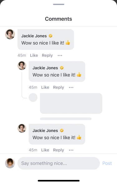
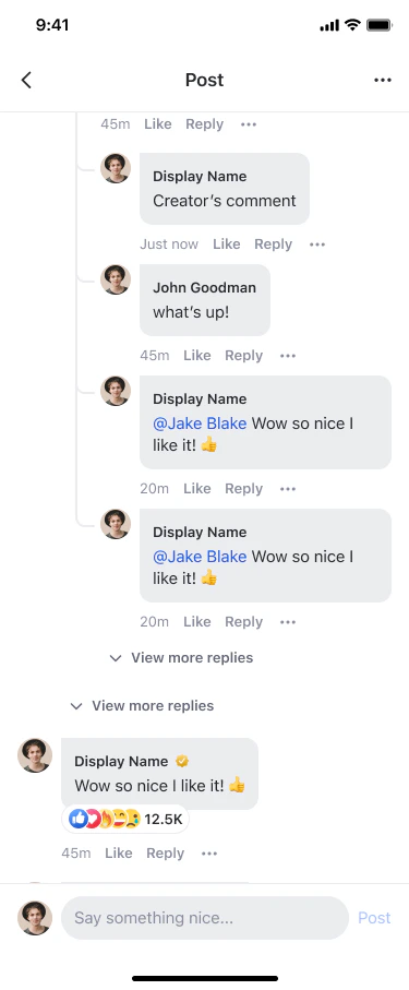
The UIKit comment system supports a **two-level display model** for replies, enabling richer conversations while keeping the UI clean.
 ### Comment Hierarchy
| Level | Display | Reply Action |
| ---------------- | --------------------------------------------- | --------------------------------------------------------------- |
| **Level 0 (L0)** | Top-level comment on a post/story | "Reply" creates an L1 reply |
| **Level 1 (L1)** | Direct reply to L0, indented under the parent | "Reply" creates an L2 reply |
| **Level 2 (L2)** | Reply to an L1 comment, indented under L1 | "Reply" creates another L2 reply (auto-resolved to L1 ancestor) |
### Comment Hierarchy
| Level | Display | Reply Action |
| ---------------- | --------------------------------------------- | --------------------------------------------------------------- |
| **Level 0 (L0)** | Top-level comment on a post/story | "Reply" creates an L1 reply |
| **Level 1 (L1)** | Direct reply to L0, indented under the parent | "Reply" creates an L2 reply |
| **Level 2 (L2)** | Reply to an L1 comment, indented under L1 | "Reply" creates another L2 reply (auto-resolved to L1 ancestor) |
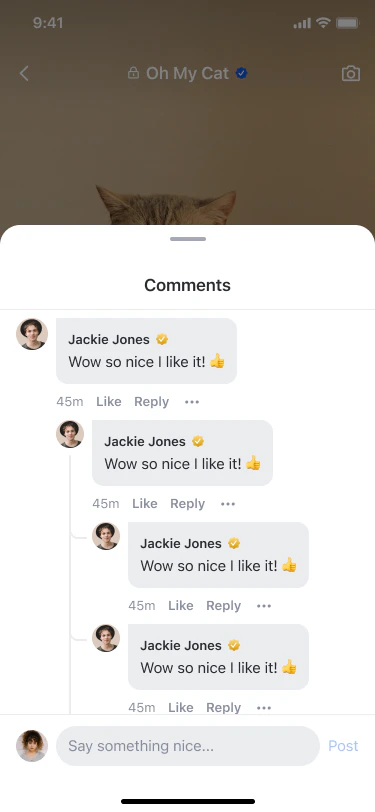 **UIKit supports up to Level 2 only.** All replies beyond Level 1 are always displayed as Level 2. When a user taps "Reply" on an L2 comment, the UIKit automatically resolves the `parentId` to the L1 ancestor, so the new reply is created as another L2 sibling — never L3 or deeper.
When a user taps "Reply" on an L2 reply, the compose bar shows **"Replying to @\[author-name]"** and pre-fills the text with `@[author-name]`. The reply is created under the L1 ancestor, not the L2 comment itself.
### Reply Thread Behavior
**Paginated reply threads with progressive loading**
**UIKit supports up to Level 2 only.** All replies beyond Level 1 are always displayed as Level 2. When a user taps "Reply" on an L2 comment, the UIKit automatically resolves the `parentId` to the L1 ancestor, so the new reply is created as another L2 sibling — never L3 or deeper.
When a user taps "Reply" on an L2 reply, the compose bar shows **"Replying to @\[author-name]"** and pre-fills the text with `@[author-name]`. The reply is created under the L1 ancestor, not the L2 comment itself.
### Reply Thread Behavior
**Paginated reply threads with progressive loading**
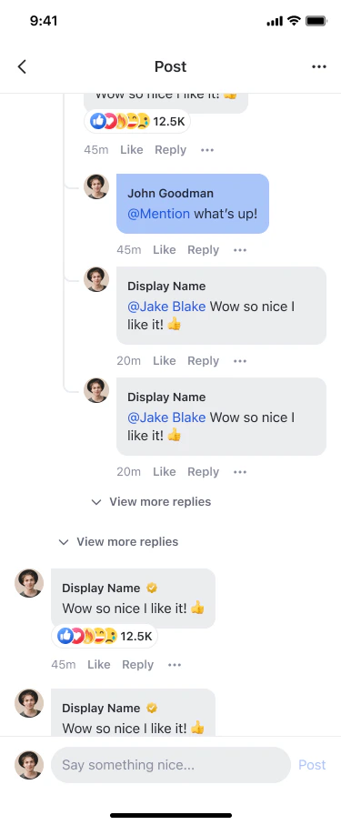 * When an L0 comment has replies, a **"View replies (n)"** button appears below it
* Tapping it loads the first page of replies (5 per batch)
* If more replies exist, a **"View more replies"** button appears at the end of the thread
* L1 replies are sorted **newest first** (`lastCreated`)
* L2 replies are sorted **oldest first** (`firstCreated`) for chronological reading
**Contextual compose bar for replies**
* When an L0 comment has replies, a **"View replies (n)"** button appears below it
* Tapping it loads the first page of replies (5 per batch)
* If more replies exist, a **"View more replies"** button appears at the end of the thread
* L1 replies are sorted **newest first** (`lastCreated`)
* L2 replies are sorted **oldest first** (`firstCreated`) for chronological reading
**Contextual compose bar for replies**
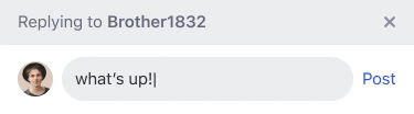 * Tapping "Reply" on any comment bubble opens the compose bar with focus
* A **"Replying to @\[author]"** chip appears above the text field
* The text field is pre-filled with `@[author-name] `
* Tapping the **✕** dismiss button on the chip clears the reply context
* Reply action is hidden for non-member users in communities (`shouldAllowCreation = false`)
**Level-specific deletion rules**
* **L0 soft delete**: Comment shows a placeholder ("This comment has been deleted") — child replies remain visible
* **L1 delete**: Reply bubble is removed from the UI; L0 parent's reply count decrements
* **L2 delete**: Only the L2 bubble is removed; L1 parent and sibling L2 replies remain
**Edit replies directly within the bubble**
* The bubble transforms into an editable text field with **Cancel** and **Save** buttons
* Save is disabled if text is empty or unchanged
**Deep-link from notification tray to specific replies**
* Tapping a reply notification navigates to the post detail page
* The screen displays the specific reply bubble with a brief highlight animation
* Tapping "Reply" on any comment bubble opens the compose bar with focus
* A **"Replying to @\[author]"** chip appears above the text field
* The text field is pre-filled with `@[author-name] `
* Tapping the **✕** dismiss button on the chip clears the reply context
* Reply action is hidden for non-member users in communities (`shouldAllowCreation = false`)
**Level-specific deletion rules**
* **L0 soft delete**: Comment shows a placeholder ("This comment has been deleted") — child replies remain visible
* **L1 delete**: Reply bubble is removed from the UI; L0 parent's reply count decrements
* **L2 delete**: Only the L2 bubble is removed; L1 parent and sibling L2 replies remain
**Edit replies directly within the bubble**
* The bubble transforms into an editable text field with **Cancel** and **Save** buttons
* Save is disabled if text is empty or unchanged
**Deep-link from notification tray to specific replies**
* Tapping a reply notification navigates to the post detail page
* The screen displays the specific reply bubble with a brief highlight animation
 ### Limitations
* UIKit supports **up to Level 2** replies. All replies beyond Level 1 are always created and displayed as Level 2 — the UIKit never creates L3 or deeper comments.
* Reply threads load **5 replies per page** by default. This is not configurable through UIKit.
## Implementation Guide
**Comprehensive comment interface with threading and reactions**
The Comment Tray Component facilitates dynamic interaction through comments and reactions, designed to foster community engagement directly within content viewing experiences.
### Features
| Feature | Description |
| ----------------------------- | --------------------------------------------------------------------------------------------- |
| View, create or edit comments | Users can view, create or edit text comments or reply comments, and add reactions to comments |
| Multi-level replies | Reply to any comment or reply (L0, L1, L2) with "Replying to" chip and @mention pre-fill |
| Expand reply threads | "View replies (n)" button to expand reply threads with paginated loading (5 per batch) |
| Inline edit | Edit L1/L2 replies directly within the comment bubble with Cancel/Save actions |
| Per-level deletion | Soft-deleted L0 shows placeholder; deleted L1/L2 replies are silently removed |
| Threaded conversations | Support for nested replies with a two-level display model |
| Real-time updates | Live synchronization of comments and reactions |
### Customization Options
| Config ID | Type | Description |
| ---------------------------------------- | --------- | ---------------------------------------------------------- |
| `*/edit_comment_component/*` | Component | You can customize theme |
| `*/edit_comment_component/cancel_button` | Element | You can customize button\_text, icon and background\_color |
| `*/edit_comment_component/save_button` | Element | You can customize button\_text, icon and background\_color |
| `*/comment_tray_component/*` | Component | You can customize close\_icon |
### Code Examples
```swift iOS theme={null}
// If you want to load comments of a post:
// referenceId: ""
// referenceType: .post
// If you want to load comments of a story:
// referenceId: ""
// referenceType: .story
let commentTrayComponent = AmityCommentTrayComponent(
referenceId: "",
referenceType: .story,
community: nil,
shouldAllowInteraction: true,
shouldAllowCreation: true
)
let viewController = AmitySwiftUIHostingController(rootView: commentTrayComponent)
```
```kotlin Android theme={null}
@Composable
fun compose(
storyId: String,
community: AmityCommunity?,
) {
// Allow user to interact like adding reaction with the story or not
val shouldAllowInteraction = true
// Allow user to create comment on the story or not
val shouldAllowCreation = true
// Available as Composable element
AmityCommentTrayComponent(
referenceId = storyId,
referenceType = AmityCommentReferenceType.STORY,
community = community, // optional
shouldAllowInteraction = shouldAllowInteraction,
shouldAllowCreation = shouldAllowCreation,
)
}
```
```typescript React theme={null}
import React from 'react';
import { AmityUIKitProvider, AmityCommentTrayComponent } from '@amityco/ui-kit';
const SampleCommentTray = ({ referenceId, referenceType, community }) => {
return (
);
};
```
```jsx React Native theme={null}
import {
AmityCommentTrayComponent,
AmityUiKitProvider,
} from 'amity-react-native-social-ui-kit';
import config from '../../uikit.config.json';
```
```dart Flutter theme={null}
void viewInCommunityProfileStory({
required String referenceId,
AmityCommentReferenceType referenceType = AmityCommentReferenceType.STORY,
required ScrollController parentScrollController,
}) {
AmityCommentTrayComponent(
referenceId: referenceId,
referenceType: referenceType,
shouldAllowComments: true,
scrollController: parentScrollController,
shouldAllowInteraction: true,
);
}
```
### Navigation Behavior
Custom navigation behavior can be implemented to enhance or modify the interaction flow on the AmityCommentTrayComponent.
```swift iOS theme={null}
class CustomAmityCommentTrayComponentBehavior: AmityCommentTrayComponentBehavior {
override init() {
super.init()
}
}
// Call this function to setup custom behaviour class in UIKit
func setCommentTrayBehaviour() {
let customBehavior = CustomAmityCommentTrayComponentBehavior()
AmityUIKit4Manager.behaviour.commentTrayComponentBehavior = customBehavior
}
```
```kotlin Android theme={null}
class CustomCommentTrayComponentBehavior : AmityCommentTrayComponentBehavior() {
}
// Call this function in AmityUIKit4Manager class to setup custom behaviour class in UIKit
fun setCustomBehavior() {
val customBehaviour = CustomCommentTrayComponentBehavior()
AmityUIKit4Manager.behavior.commentTrayComponentBehavior = customBehaviour
}
```
```typescript React theme={null}
import React from 'react';
import { AmityUIKitProvider, AmityCommentTrayComponent } from '@amityco/ui-kit';
const SampleCommentTray = ({ referenceId, referenceType, community }) => {
return (
{
console.log('Navigate to user profile:', userId);
},
},
}}
>
);
};
```
**Detailed reaction information and user engagement analytics**
The Reaction List Component displays comprehensive information about users who have reacted to content and their specific reactions.
### Features
| Feature | Description |
| ------------------ | ------------------------------------------------------------------------------ |
| Reaction List | Users can view the list of users who reacted to the post with reaction details |
| User Interaction | Navigate to user profiles from reaction lists |
| Reaction Analytics | View reaction distribution and engagement metrics |
### Customization Options
| Config ID | Type | Description |
| ------------------------------------- | ------- | --------------------------------- |
| `*/reaction_list/*` | Theme | You can customize component theme |
| `*/reaction_list/user_avatar_view` | Element | You can hide avatar image view |
| `*/reaction_list/user_display_name` | Element | You can hide display name |
| `*/reaction_list/reaction_image_view` | Element | You can hide reaction icon |
### Code Examples
```swift iOS theme={null}
// Create reaction list component
let reactionListView = AmityReactionList(referenceId: "", referenceType: .post)
let viewController = AmitySwiftUIHostingController(rootView: reactionListView)
```
```kotlin Android theme={null}
@Composable
fun ReactionListSample(
referenceType: AmityReactionReferenceType,
referenceId: String
) {
AmityReactionList(
referenceType = referenceType,
referenceId = referenceId
)
}
```
```typescript React theme={null}
import React from 'react';
import { AmityUIKitProvider, AmityReactionListComponent } from '@amityco/ui-kit';
const SampleAmityReactionListComponent = () => {
return (
);
};
```
```jsx React Native theme={null}
import {
AmityReactionListComponent,
AmityUiKitProvider,
} from 'amity-react-native-social-ui-kit';
import config from '../../uikit.config.json';
{}}
/>
```
```dart Flutter theme={null}
Widget postReactionList() {
return AmityReactionList(
referenceId: 'referenceId',
referenceType: AmityReactionReferenceType.POST);
}
```
### Navigation Behavior
```swift iOS theme={null}
class CustomAmityReactionListBehavior: AmityReactionListBehavior {
override init() {
super.init()
}
override func goToUserProfile(context: AmityReactionListBehavior.Context) {
// Custom implementation for navigating to User Profile
}
}
// Call this function to setup custom behaviour class in UIKit
func setReactionListBehaviour() {
let customBehavior = CustomAmityReactionListBehavior()
AmityUIKit4Manager.behaviour.reactionListBehavior = customBehavior
}
```
```kotlin Android theme={null}
class CustomReactionListBehavior : AmityReactionListBehavior() {
override fun goToUserProfile(context: Context, userId: String) {
// Custom implementation for navigating to User Profile
}
}
// Call this function in AmityUIKit4Manager class to setup custom behaviour class in UIKit
fun setCustomBehavior() {
val customBehaviour = CustomReactionListBehavior()
AmityUIKit4Manager.behavior.reactionListBehavior = customBehaviour
}
```
```typescript React theme={null}
import React from 'react';
import { AmityUIKitProvider, AmityReactionListComponent } from '@amityco/ui-kit';
const SampleReactionList = () => {
return (
{
console.log('Navigate to user profile:', userId);
},
},
}}
>
);
};
```
**Configurable reaction systems for enhanced user expression**
The UIKit supports multiple reaction types for both posts and comments, allowing you to customize different reaction sets for social features and messaging features to match your community's engagement patterns.
**Global Configuration**: These reaction configurations are set at the global level in AmityUIKitConfig.json and apply across all UIKit components automatically.
### Features
| Feature | Description |
| ---------------------- | --------------------------------------------------------------------------------- |
| Dual Reaction Systems | Separate reaction configurations for social posts/comments and messaging features |
| Custom Reaction Sets | Configure different emoji reactions for different contexts |
| Global Configuration | Set once at the application level for consistent experience |
| Cross-Platform Support | Consistent reaction experience across all supported platforms |
### Post/Comment Reactions Configuration
Configure reactions specifically for social posts and comments:
```json theme={null}
{
"social_reactions": [
{
"name": "like",
"image": "messageReactionLike"
},
{
"name": "love",
"image": "messageReactionHeart"
},
{
"name": "fire",
"image": "messageReactionFire"
},
{
"name": "happy",
"image": "messageReactionGrinning"
},
{
"name": "sad",
"image": "messageReactionSad"
}
]
}
```
### Message Reactions Configuration
Configure reactions specifically for direct messages and chat:
```json theme={null}
{
"message_reactions": [
{
"name": "heart",
"image": "messageReactionHeart"
},
{
"name": "like",
"image": "messageReactionLike"
},
{
"name": "fire",
"image": "messageReactionFire"
},
{
"name": "grinning",
"image": "messageReactionGrinning"
},
{
"name": "sad",
"image": "messageReactionSad"
}
]
}
```
### Configuration Benefits
| Configuration Type | Use Case | Benefits |
| --------------------- | ------------------------ | ---------------------------------------------------------- |
| **Social Reactions** | Posts and Comments | Optimized for community engagement and content interaction |
| **Message Reactions** | Direct Messages and Chat | Tailored for conversational context and quick responses |
| **Global Level** | Application-wide | Consistent experience across all components and features |
### Best Practices
**Matching reactions to user context**
Configure different reaction sets based on the interaction context. Use more expressive reactions for social posts and streamlined options for quick message responses. Consider your community's communication patterns when selecting reaction types.
**maintaining coherent reaction experiences**
Ensure reaction images and names are consistent across platforms. Use clear, universally understood emoji representations. Test reaction visibility and accessibility across different devices and screen sizes.
## Component Management Strategies
**Creating engaging conversation experiences**
Design comment systems that encourage meaningful dialogue while maintaining community standards. Implement clear threading, easy reply mechanisms, and intuitive editing capabilities. Consider moderation needs and user reporting flows early in design.
**Optimizing reaction engagement**
Choose reaction sets that match your community culture and content types. Implement clear visual feedback for user interactions and consider analytics to understand engagement patterns. Balance expressiveness with simplicity.
## Best Practices
**Creating intuitive comment experiences**
Design comment interfaces that encourage meaningful conversations while maintaining readability. Implement clear visual hierarchy for threaded discussions, provide easy access to reply and edit functions, and ensure comment moderation tools are readily available to maintain community standards.
**Optimizing reaction engagement**
Choose reaction sets that match your community culture and content types. Implement clear visual feedback for user interactions, consider analytics to understand engagement patterns, and balance expressiveness with simplicity to avoid overwhelming users.
## Related Components
Explore post components that integrate with comment and reaction systems.
Learn about feed components that display posts with comment and reaction previews.
Understand user profile features that showcase comment and reaction activity.
Discover community features that provide context for comments and reactions.
**Implementation Strategy**: Start with AmityCommentTrayComponent for comprehensive comment functionality, then add AmityReactionListComponent for detailed user engagement insights. Integrate reaction features gradually based on your community engagement goals and user feedback patterns.
### Limitations
* UIKit supports **up to Level 2** replies. All replies beyond Level 1 are always created and displayed as Level 2 — the UIKit never creates L3 or deeper comments.
* Reply threads load **5 replies per page** by default. This is not configurable through UIKit.
## Implementation Guide
**Comprehensive comment interface with threading and reactions**
The Comment Tray Component facilitates dynamic interaction through comments and reactions, designed to foster community engagement directly within content viewing experiences.
### Features
| Feature | Description |
| ----------------------------- | --------------------------------------------------------------------------------------------- |
| View, create or edit comments | Users can view, create or edit text comments or reply comments, and add reactions to comments |
| Multi-level replies | Reply to any comment or reply (L0, L1, L2) with "Replying to" chip and @mention pre-fill |
| Expand reply threads | "View replies (n)" button to expand reply threads with paginated loading (5 per batch) |
| Inline edit | Edit L1/L2 replies directly within the comment bubble with Cancel/Save actions |
| Per-level deletion | Soft-deleted L0 shows placeholder; deleted L1/L2 replies are silently removed |
| Threaded conversations | Support for nested replies with a two-level display model |
| Real-time updates | Live synchronization of comments and reactions |
### Customization Options
| Config ID | Type | Description |
| ---------------------------------------- | --------- | ---------------------------------------------------------- |
| `*/edit_comment_component/*` | Component | You can customize theme |
| `*/edit_comment_component/cancel_button` | Element | You can customize button\_text, icon and background\_color |
| `*/edit_comment_component/save_button` | Element | You can customize button\_text, icon and background\_color |
| `*/comment_tray_component/*` | Component | You can customize close\_icon |
### Code Examples
```swift iOS theme={null}
// If you want to load comments of a post:
// referenceId: ""
// referenceType: .post
// If you want to load comments of a story:
// referenceId: ""
// referenceType: .story
let commentTrayComponent = AmityCommentTrayComponent(
referenceId: "",
referenceType: .story,
community: nil,
shouldAllowInteraction: true,
shouldAllowCreation: true
)
let viewController = AmitySwiftUIHostingController(rootView: commentTrayComponent)
```
```kotlin Android theme={null}
@Composable
fun compose(
storyId: String,
community: AmityCommunity?,
) {
// Allow user to interact like adding reaction with the story or not
val shouldAllowInteraction = true
// Allow user to create comment on the story or not
val shouldAllowCreation = true
// Available as Composable element
AmityCommentTrayComponent(
referenceId = storyId,
referenceType = AmityCommentReferenceType.STORY,
community = community, // optional
shouldAllowInteraction = shouldAllowInteraction,
shouldAllowCreation = shouldAllowCreation,
)
}
```
```typescript React theme={null}
import React from 'react';
import { AmityUIKitProvider, AmityCommentTrayComponent } from '@amityco/ui-kit';
const SampleCommentTray = ({ referenceId, referenceType, community }) => {
return (
);
};
```
```jsx React Native theme={null}
import {
AmityCommentTrayComponent,
AmityUiKitProvider,
} from 'amity-react-native-social-ui-kit';
import config from '../../uikit.config.json';
```
```dart Flutter theme={null}
void viewInCommunityProfileStory({
required String referenceId,
AmityCommentReferenceType referenceType = AmityCommentReferenceType.STORY,
required ScrollController parentScrollController,
}) {
AmityCommentTrayComponent(
referenceId: referenceId,
referenceType: referenceType,
shouldAllowComments: true,
scrollController: parentScrollController,
shouldAllowInteraction: true,
);
}
```
### Navigation Behavior
Custom navigation behavior can be implemented to enhance or modify the interaction flow on the AmityCommentTrayComponent.
```swift iOS theme={null}
class CustomAmityCommentTrayComponentBehavior: AmityCommentTrayComponentBehavior {
override init() {
super.init()
}
}
// Call this function to setup custom behaviour class in UIKit
func setCommentTrayBehaviour() {
let customBehavior = CustomAmityCommentTrayComponentBehavior()
AmityUIKit4Manager.behaviour.commentTrayComponentBehavior = customBehavior
}
```
```kotlin Android theme={null}
class CustomCommentTrayComponentBehavior : AmityCommentTrayComponentBehavior() {
}
// Call this function in AmityUIKit4Manager class to setup custom behaviour class in UIKit
fun setCustomBehavior() {
val customBehaviour = CustomCommentTrayComponentBehavior()
AmityUIKit4Manager.behavior.commentTrayComponentBehavior = customBehaviour
}
```
```typescript React theme={null}
import React from 'react';
import { AmityUIKitProvider, AmityCommentTrayComponent } from '@amityco/ui-kit';
const SampleCommentTray = ({ referenceId, referenceType, community }) => {
return (
{
console.log('Navigate to user profile:', userId);
},
},
}}
>
);
};
```
**Detailed reaction information and user engagement analytics**
The Reaction List Component displays comprehensive information about users who have reacted to content and their specific reactions.
### Features
| Feature | Description |
| ------------------ | ------------------------------------------------------------------------------ |
| Reaction List | Users can view the list of users who reacted to the post with reaction details |
| User Interaction | Navigate to user profiles from reaction lists |
| Reaction Analytics | View reaction distribution and engagement metrics |
### Customization Options
| Config ID | Type | Description |
| ------------------------------------- | ------- | --------------------------------- |
| `*/reaction_list/*` | Theme | You can customize component theme |
| `*/reaction_list/user_avatar_view` | Element | You can hide avatar image view |
| `*/reaction_list/user_display_name` | Element | You can hide display name |
| `*/reaction_list/reaction_image_view` | Element | You can hide reaction icon |
### Code Examples
```swift iOS theme={null}
// Create reaction list component
let reactionListView = AmityReactionList(referenceId: "", referenceType: .post)
let viewController = AmitySwiftUIHostingController(rootView: reactionListView)
```
```kotlin Android theme={null}
@Composable
fun ReactionListSample(
referenceType: AmityReactionReferenceType,
referenceId: String
) {
AmityReactionList(
referenceType = referenceType,
referenceId = referenceId
)
}
```
```typescript React theme={null}
import React from 'react';
import { AmityUIKitProvider, AmityReactionListComponent } from '@amityco/ui-kit';
const SampleAmityReactionListComponent = () => {
return (
);
};
```
```jsx React Native theme={null}
import {
AmityReactionListComponent,
AmityUiKitProvider,
} from 'amity-react-native-social-ui-kit';
import config from '../../uikit.config.json';
{}}
/>
```
```dart Flutter theme={null}
Widget postReactionList() {
return AmityReactionList(
referenceId: 'referenceId',
referenceType: AmityReactionReferenceType.POST);
}
```
### Navigation Behavior
```swift iOS theme={null}
class CustomAmityReactionListBehavior: AmityReactionListBehavior {
override init() {
super.init()
}
override func goToUserProfile(context: AmityReactionListBehavior.Context) {
// Custom implementation for navigating to User Profile
}
}
// Call this function to setup custom behaviour class in UIKit
func setReactionListBehaviour() {
let customBehavior = CustomAmityReactionListBehavior()
AmityUIKit4Manager.behaviour.reactionListBehavior = customBehavior
}
```
```kotlin Android theme={null}
class CustomReactionListBehavior : AmityReactionListBehavior() {
override fun goToUserProfile(context: Context, userId: String) {
// Custom implementation for navigating to User Profile
}
}
// Call this function in AmityUIKit4Manager class to setup custom behaviour class in UIKit
fun setCustomBehavior() {
val customBehaviour = CustomReactionListBehavior()
AmityUIKit4Manager.behavior.reactionListBehavior = customBehaviour
}
```
```typescript React theme={null}
import React from 'react';
import { AmityUIKitProvider, AmityReactionListComponent } from '@amityco/ui-kit';
const SampleReactionList = () => {
return (
{
console.log('Navigate to user profile:', userId);
},
},
}}
>
);
};
```
**Configurable reaction systems for enhanced user expression**
The UIKit supports multiple reaction types for both posts and comments, allowing you to customize different reaction sets for social features and messaging features to match your community's engagement patterns.
**Global Configuration**: These reaction configurations are set at the global level in AmityUIKitConfig.json and apply across all UIKit components automatically.
### Features
| Feature | Description |
| ---------------------- | --------------------------------------------------------------------------------- |
| Dual Reaction Systems | Separate reaction configurations for social posts/comments and messaging features |
| Custom Reaction Sets | Configure different emoji reactions for different contexts |
| Global Configuration | Set once at the application level for consistent experience |
| Cross-Platform Support | Consistent reaction experience across all supported platforms |
### Post/Comment Reactions Configuration
Configure reactions specifically for social posts and comments:
```json theme={null}
{
"social_reactions": [
{
"name": "like",
"image": "messageReactionLike"
},
{
"name": "love",
"image": "messageReactionHeart"
},
{
"name": "fire",
"image": "messageReactionFire"
},
{
"name": "happy",
"image": "messageReactionGrinning"
},
{
"name": "sad",
"image": "messageReactionSad"
}
]
}
```
### Message Reactions Configuration
Configure reactions specifically for direct messages and chat:
```json theme={null}
{
"message_reactions": [
{
"name": "heart",
"image": "messageReactionHeart"
},
{
"name": "like",
"image": "messageReactionLike"
},
{
"name": "fire",
"image": "messageReactionFire"
},
{
"name": "grinning",
"image": "messageReactionGrinning"
},
{
"name": "sad",
"image": "messageReactionSad"
}
]
}
```
### Configuration Benefits
| Configuration Type | Use Case | Benefits |
| --------------------- | ------------------------ | ---------------------------------------------------------- |
| **Social Reactions** | Posts and Comments | Optimized for community engagement and content interaction |
| **Message Reactions** | Direct Messages and Chat | Tailored for conversational context and quick responses |
| **Global Level** | Application-wide | Consistent experience across all components and features |
### Best Practices
**Matching reactions to user context**
Configure different reaction sets based on the interaction context. Use more expressive reactions for social posts and streamlined options for quick message responses. Consider your community's communication patterns when selecting reaction types.
**maintaining coherent reaction experiences**
Ensure reaction images and names are consistent across platforms. Use clear, universally understood emoji representations. Test reaction visibility and accessibility across different devices and screen sizes.
## Component Management Strategies
**Creating engaging conversation experiences**
Design comment systems that encourage meaningful dialogue while maintaining community standards. Implement clear threading, easy reply mechanisms, and intuitive editing capabilities. Consider moderation needs and user reporting flows early in design.
**Optimizing reaction engagement**
Choose reaction sets that match your community culture and content types. Implement clear visual feedback for user interactions and consider analytics to understand engagement patterns. Balance expressiveness with simplicity.
## Best Practices
**Creating intuitive comment experiences**
Design comment interfaces that encourage meaningful conversations while maintaining readability. Implement clear visual hierarchy for threaded discussions, provide easy access to reply and edit functions, and ensure comment moderation tools are readily available to maintain community standards.
**Optimizing reaction engagement**
Choose reaction sets that match your community culture and content types. Implement clear visual feedback for user interactions, consider analytics to understand engagement patterns, and balance expressiveness with simplicity to avoid overwhelming users.
## Related Components
Explore post components that integrate with comment and reaction systems.
Learn about feed components that display posts with comment and reaction previews.
Understand user profile features that showcase comment and reaction activity.
Discover community features that provide context for comments and reactions.
**Implementation Strategy**: Start with AmityCommentTrayComponent for comprehensive comment functionality, then add AmityReactionListComponent for detailed user engagement insights. Integrate reaction features gradually based on your community engagement goals and user feedback patterns.